5 Myths About Glass Door Refrigeration


Global growth in the café and coffee shop market has continued for over 20 years. And the past five years has seen the most significant growth since 2008.[1]
Growth has come from across the foodservice industry, from McDonald’s building their McCafe concept to answer pressure from brands including Starbucks, the rise of drive-through coffee outlets, the spread of US and Canadian brands like Tim Horton’s and Dunkin’ Donuts to Europe and an increasing number of smaller chains and independent outlets entering the market.
So, what can you do to gain an edge in a growing market with increasing competition? This article will explore ways cafés and coffee shops improve productivity and sales through clever store layout, and how you can do the same.
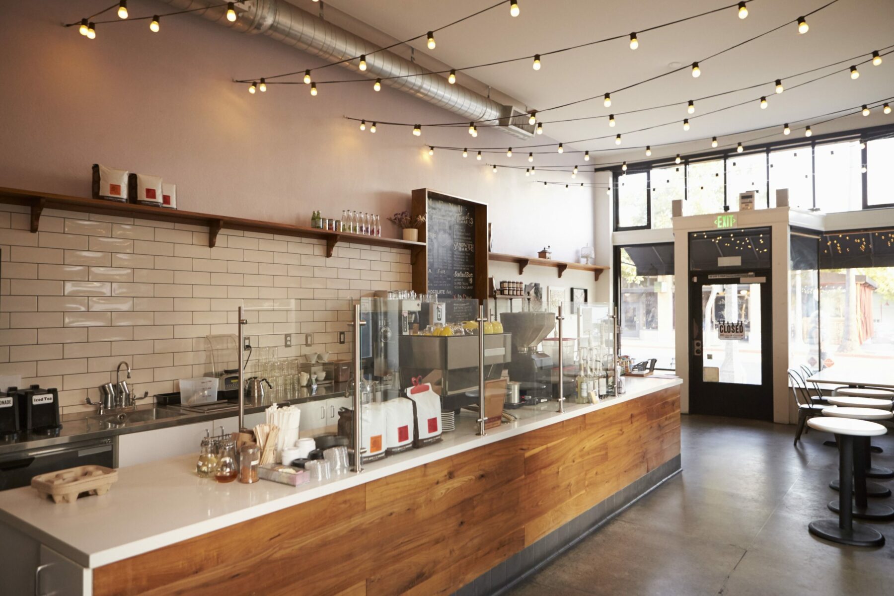
If you picture well-known café brands in your mind you will start to notice a pattern in the way stores are laid out. While the nature of outlets is ‘coffee first’ (it is a café after all), meaning hot drinks take priority, you’ll often find other options are made available to customers before they place an order.
You see customers enjoying food and drinks that might tempt you away from your regular order yet don’t block access to the counter. Then the customer is offered cold food options, hot food options, sweet treats to take away, images of new or seasonal drinks and offers before they arrive at the counter to place their order.
This is no accident. Brands have done their research to ensure they understand the customer experience, and the layout of outlets is optimized to sell as much as possible, in a way that still makes customers feel welcome and relaxed, not overwhelmed with products and offers.

Store layout is key.
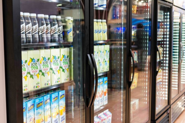
Display refrigeration can help to increase the visibility of the food and drink you offer, and customization offered by brands like True helps to ensure units match with your décor, so they fit with the style and mood customers expect.
The goal is to offer a range that is inclusive of your customers’ needs—something hot, something cold, something savory or sweet, even a vegetarian option—without being too overwhelming by offering too many choices. An overly expansive product offering may result in too much waste and cut into your bottom line. Profitable brands offer a targeted selection of customer favorites, with keen monitoring on sales to ensure overstocking is kept to a minimum.
Wasted energy from inefficient units can also be an issue. Be sure that you source equipment that’s visually appealing, robust and environmentally-savvy to give you the best value.
Tempting customers as they approach the counter is one way to increase your sales, but the final decision will be made at the point-of-sale. Here is where the layout of your service area should be considered. From neighboring display cases to visible undercounters, give your customers the option to make add-on choices when they place their order.
Placing storage units or cooking equipment in the customer’s line of sight could potentially be a wasted opportunity, especially if you are working in a smaller outlet. Plan for your customers’ foot traffic patterns and imagine what they will see to promote certain popular items.
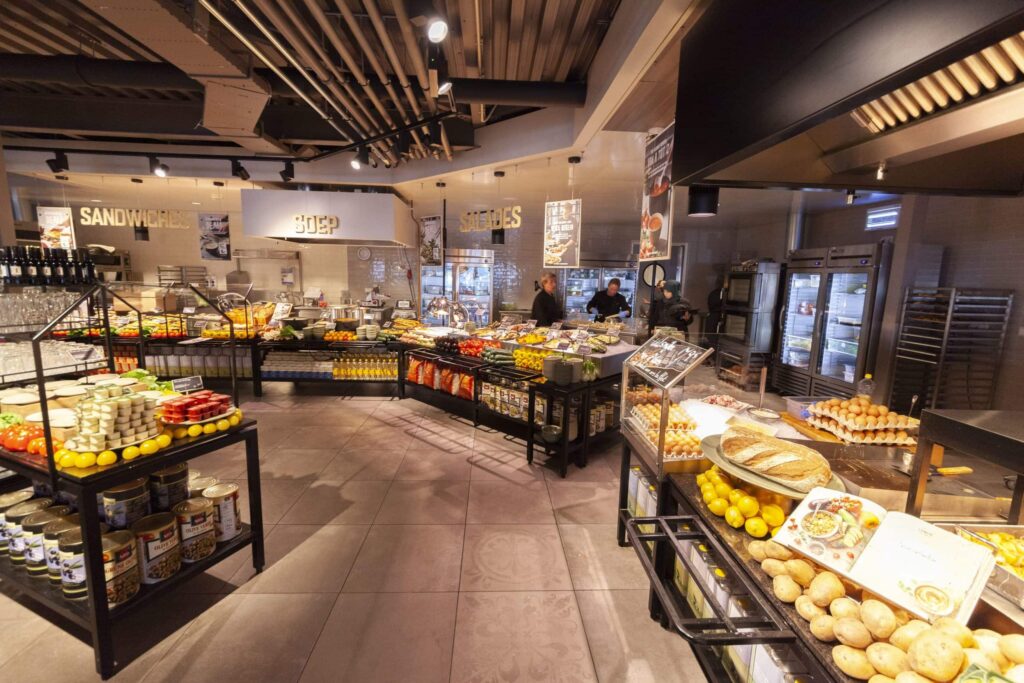
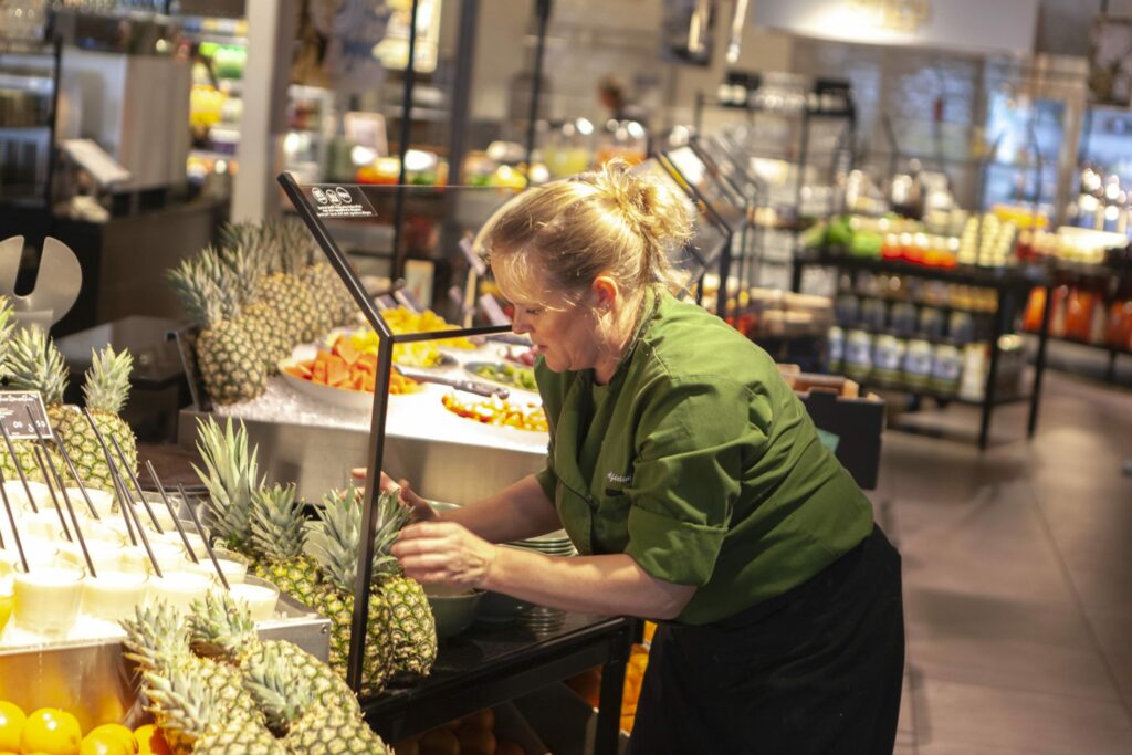
If you do need to place food ingredients and products within your customers’ eyesight, be creative with your idea. Netherlands-based La Place, a freshly prepared food concept that uses exclusively True products at their locations, is one example. It could be a good opportunity to show off the freshness of your ingredients and boost the perception of your brand.

La Place display products in attractive ways to help entice customers.
Once an order has been placed, serving customers quickly means you can move onto the next order, and they’re not left waiting.
At this point your back of house layout is essential. Equipment should be easy to access, and staff should have the freedom to retrieve the tools and ingredients they need. This helps ensure speedy service and reduces the risk of accidents.
Where mapping the customer experience is important for front of house, an understanding of how staff will need to move around the space to serve customers is required. It is important to consider what is visible to customers too. The theater of making drinks can be exciting, but dirty dishes or food waste can put customers off.
There is a potential additional win with the café market, the secondary takeaway purchase. Perhaps a customer has had their coffee but could be tempted by a snack for later. What customers have seen can inspire a second purchase, and for this reason, it is important to understand the customer’s wishes after their initial order.
Displaying your products so they’re visible at the entrances and exits is a great way to achieve this, which is why you’ll often find a café’s main purchase and service areas sit at an angle to the main point of entry, to improve overall visibility.
The opportunities to build sales and profit from your café or coffee shop can always be improved. Small tweaks to layout and décor can improve the customer perception of your brand, while the quality of your product and service will always be essential to keep people coming back for more.
True can help you with all these aspects, offering refrigeration solutions that look great, promote sustainability and keep products fresh and delicious. Get in touch to see the great products we offer.
[1] Source: Mintel Research